


Cart 0

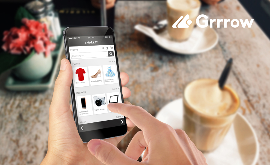
Mobile commerce is on the rise, and it’s changing the way people shop online. More and more customers are using their phones to browse and buy products. This trend means that Shopify store owners must prioritize mobile optimization to stay competitive. In this article, we’ll explore why mobile optimization is essential for Shopify stores in 2024 and how it can boost your business.
The Current Mobile Commerce Landscape
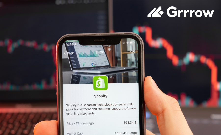
Mobile commerce (m-commerce) is booming. As of 2024, over half of all online shopping happens on mobile devices, with global sales expected to hit $4.5 trillion this year. Shoppers love the convenience of mobile shopping, whether at home or on the go.
Consumer expectations are high. They want fast, seamless experiences, and any delays or difficult navigation can lead to frustration and lost sales. Successful Shopify stores prioritize mobile optimization to meet these expectations and stay competitive.
Why Mobile Optimization Matters
- Enhanced User Experience
A mobile-optimized site offers faster loading times and easy navigation, making shopping more enjoyable. Users can quickly find and view products without delays, encouraging them to spend more time on your site. - Higher Conversion Rates
A smooth mobile experience boosts conversion rates. Optimized checkout processes and features like mobile-friendly payments and one-click checkout reduce cart abandonment, making it easier for customers to complete their purchases. - Better SEO Performance
Mobile optimization improves SEO. Google’s mobile-first indexing prioritizes mobile-friendly sites in search rankings. A higher ranking increases visibility, driving more organic traffic to your store and attracting more potential customers.
Key Elements of Mobile Optimization for Shopify Stores
- Responsive Design
Responsive design is a must for any Shopify store. It means your site automatically adjusts to fit the screen size of the device being used. A responsive theme ensures that your site looks great and functions perfectly whether it’s viewed on a smartphone, tablet, or desktop. When choosing a theme, make sure it’s responsive so that every visitor has a smooth experience, no matter what device they use. - Mobile-Friendly Features
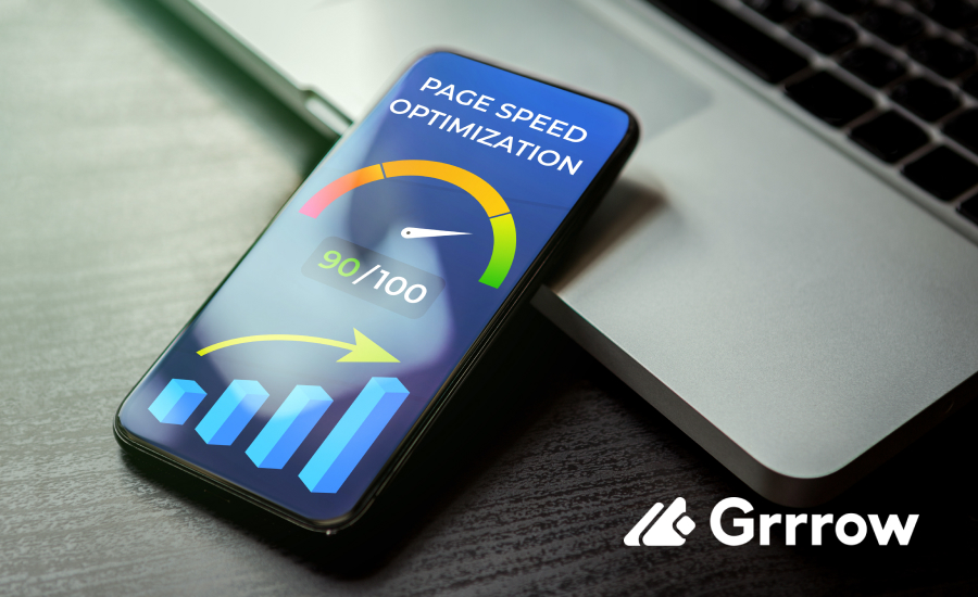
Incorporating mobile-friendly features can greatly enhance the user experience. One important feature is Accelerated Mobile Pages (AMP), which loads pages faster on mobile devices. This speed can keep users engaged and reduce bounce rates. Additionally, consider adding mobile-specific features such as one-click checkout and mobile payment options. These features simplify the purchasing process, making it easier and quicker for customers to buy from your store. - Optimized Images and Content
Fast-loading images are crucial for mobile optimization. Large, high-resolution images can slow down your site, leading to frustration for users. Use tools to compress and optimize images without sacrificing quality. Besides images, your content should also be optimized for mobile. Keep paragraphs short and to the point, use bullet points for easy reading, and ensure that buttons and links are large enough to tap easily.
Tools and Resources for Mobile Optimization
- Shopify Apps
Shopify offers apps like “Plug in Speed” and “Image Optimizer” to boost loading speed by compressing images and optimizing code. “Smart SEO” helps improve search engine rankings by optimizing content for mobile. - Google Tools
Google’s free tools, such as the Mobile-Friendly Test and PageSpeed Insights, analyze your site’s mobile performance and provide suggestions for improvement. - Other Resources
Websites like GTmetrix and Pingdom offer detailed performance analyses and tips to enhance your site’s speed and user experience on mobile devices.
Best Practices for Maintaining Mobile Optimization
- Regular Testing
Consistently test your site on various mobile devices using tools like Google Mobile-Friendly Test and PageSpeed Insights. This helps identify and fix issues before they impact users.
- Continuous Updates
Keep your themes, plugins, and apps updated to the latest versions. Updates often include performance enhancements and new features that improve mobile optimization.
- Monitor Analytics
Use tools like Google Analytics to track key metrics such as bounce rate and conversion rates. Analyzing this data helps you understand user behavior and pinpoint areas for improvement.
- Stay Updated with Trends
Follow industry blogs, attend webinars, and participate in online communities to stay informed about the latest mobile optimization trends and techniques.
- User Feedback
Encourage customers to provide feedback on their mobile experience. Use surveys and reviews to gather insights and make necessary adjustments to enhance the user experience.

Conclusion
In 2024, mobile optimization is essential for Shopify store owners. With mobile commerce growing rapidly, having a mobile-friendly site is crucial for success. A mobile-optimized site improves user experience, boosts conversion rates, and enhances SEO performance.
Key elements include responsive design, mobile-friendly features, and optimized images. Use tools like Shopify apps and Google’s testing tools, and follow best practices such as regular testing and updates to maintain optimal performance.

